
Why Bold Colors Suit Nail Art (And How to Wear Them Right)
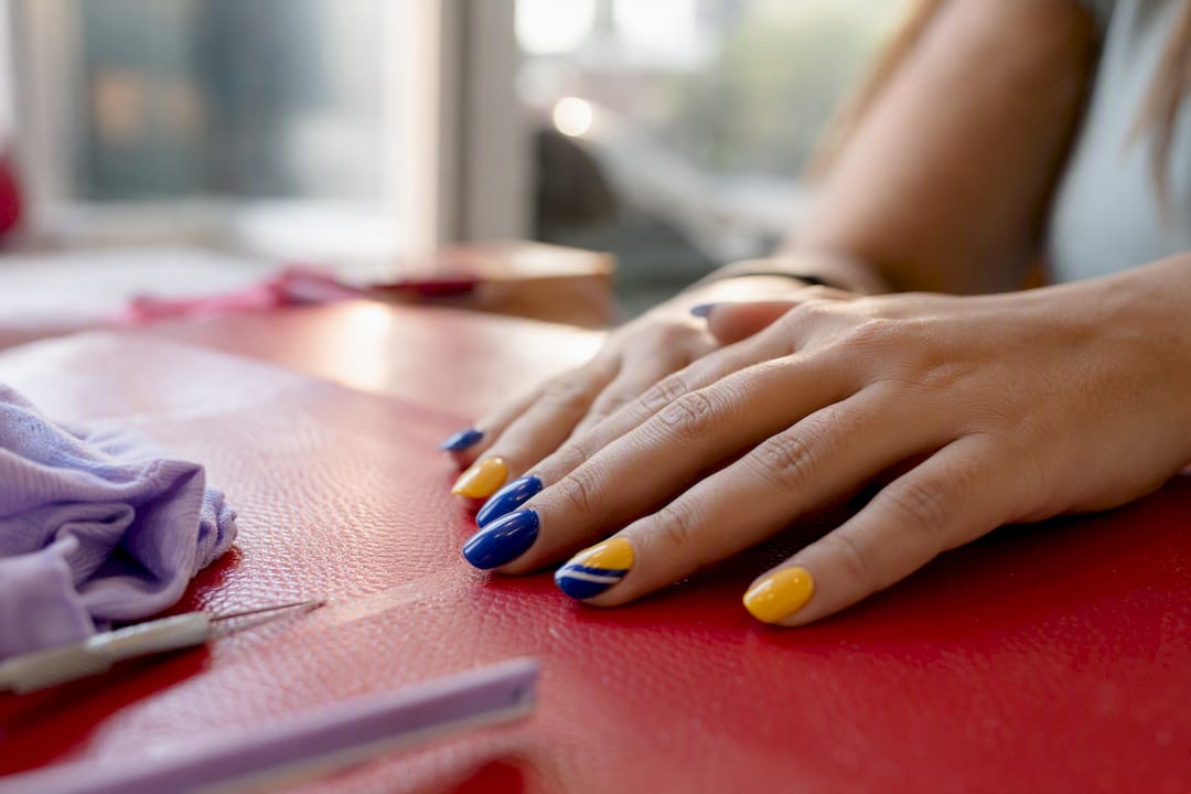
Bold colors suit nail art because high chroma and sharp contrast make tiny canvases read loud, and because color triggers real psychological effects tied to mood and how others perceive you. Nails are small, but they move constantly and sit in your peripheral vision all day. Bold shades work with that, not against it.
Bold colors read clearly at small scale and draw the eye faster than muted tones
High saturation and contrast create visual impact you notice in hand movement and in passing glances from others
Color has measurable effects on mood, confidence, and perceived energy, depending on the hue you pick
Key Takeaways
Bold nail colors work because high saturation and contrast make small surfaces visible, and specific hues carry real psychological effects on mood and perception.
Point | Details |
Saturation drives visibility | High-chroma colors read clearly at nail scale, unlike muted or pastel tones. |
Color affects mood and perception | Warm hues like red raise energy and confidence; cool hues like blue calm things down. |
Undertone guides shade choice | Warm undertones suit coral and tangerine; cool undertones suit fuchsia and sapphire. |
Finish controls intensity | Matte mutes boldness while gloss and metallics amplify it. |
Accents manage commitment | An accent nail or colored tip delivers boldness without a full set. |
Table of Contents
Why Bold Colors Suit Nail Art: The Psychology Behind It
Color affects arousal, mood, and how people read your social presence, and warm saturated hues do more of that work than muted ones. Research on color and emotion shows that warm, saturated tones like red and orange raise activation, while cooler tones like blue and green tend to calm things down, according to a 2025 review of color characteristics and emotional response-1056-1070). Nails amplify this because you see them constantly. Every gesture puts that color back in front of your eyes, so the emotional cue repeats itself dozens of times a day in a way a scarf or a wall color never does.
Red nails have been tied to perceived confidence and increased social attention, with some research linking red to higher attractiveness ratings in certain social contexts.
That’s the logic behind the red nail theory, which took off because red does something specific: it grabs attention and signals boldness fast. Blue tends to read as composed. Yellow reads as energetic, sometimes almost playful. None of this is universal law. Cultural background and personal association shift how a color lands, but the broad pattern holds across most people you’ll meet.
Color Theory Basics That Make Bold Nail Art Work
Saturation, or chroma, measures how intense a color is compared to a washed-out or grayed-down version of the same hue. High-chroma polish reads clearly even on a nail the size of a fingertip, which is exactly why bold shades photograph and register better than pastels at that scale. Pairing strategy matters just as much as the color itself. Complementary pairs, opposite each other on the color wheel like orange and blue, create punch. Analogous pairs, sitting next to each other like teal and emerald, feel cohesive rather than jarring. Monochrome looks, several shades of one hue, add depth without adding visual noise. Fashion designers lean on these exact relationships to build outfits that hold together, and the same color theory principles translate directly to a manicure.
Complementary pairings create the strongest visual contrast for statement looks
Analogous pairings feel calmer and easier to wear daily
Monochrome sets add richness without competing colors
Pro Tip: If a combination feels too loud, keep the saturation high on one nail (an accent) and drop the rest of the set to a lower-chroma neutral from the same color family. You get the punch without every finger shouting at once.
Choosing Bold Colors for Your Skin Tone and Undertone
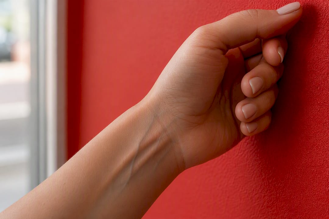
Start with an undertone check for the best bikini colors. Look at the veins on your wrist: greenish veins usually mean a warm undertone, bluish veins mean cool, and a mix of both usually means neutral. Gold jewelry that flatters you over silver is another hint toward warm; the reverse points cool.
Warm undertones tend to look best in coral, tangerine, and teal, all shades with a golden or orange base
Cool undertones usually suit fuchsia, sapphire, and emerald, since blue-based hues sit closer to their natural coloring
Neutral undertones have the most flexibility and can wear true red or deep jewel tones without a clash
Beauty guides that match polish to skin tone consistently point to this same undertone-first approach, and it works because the goal is harmony between your natural coloring and the pigment on your nail, not a rulebook about “matching” skin to polish.
Full-nail boldness isn’t always the right call. In conservative workplaces or for anyone who prefers understated hands, an accent nail or colored tip delivers the same personality in a smaller dose.
Vein color and jewelry preference are quick, reliable undertone checks
Warm, cool, and neutral undertones each have shade families that flatter naturally
Accents and tips let you wear bold color without committing a full set
Finishes, Shape, and Placement That Control the Boldness
Finish changes how loud a color reads before you even factor in the hue itself. Metallics and high gloss throw light back and read brighter than the same pigment in a flat formula. Matte finishes absorb light and mute even the most saturated shade, which is useful if you want boldness without shine. Shimmer and foil add drama and work especially well on shorter nails, where a flat color can look plain.
Nail length and shape matter too. Longer nails and squared or almond shapes give bold color more surface area to register, while short round nails need higher contrast to read at all from a distance.
Metallic and glossy finishes amplify perceived saturation
Matte finishes tone down intensity while keeping the hue
Negative space and accent nails let you dial boldness up or down without changing the palette
Pro Tip: If you love a color but worry it’s too much for daily wear, ask your technician to leave a thin strip of negative space at the cuticle. It breaks up the block of color and instantly reads more polished.
Bold Nail Color Palettes to Try
Electric blue with gold micro-foil flecks, a statement look best suited to nights out or events, and it works beautifully on cool undertones
Deep berry with rose gold shimmer for a wearable bold that still feels dressed up, flattering on warm and neutral undertones alike
Lime green as an accent nail on a neutral base, a low-commitment way to test bright color without covering all ten nails
True red in high gloss, the classic confidence pick that works across seasons and undertones
Sapphire and emerald in a monochrome jewel-tone set, ideal for anyone who wants richness without mixing hues
Tangerine with a matte topcoat, a warm-undertone favorite that reads bold without shine drawing extra attention
Salon Tips for Getting Your Bold Manicure Right
Bring your technician a photo, not just a color word. “Coral” means something different to every person, but a photo removes the guesswork.
Referencing a specific polish name or showing a picture gets you a far closer match than describing a color from memory, and most salons can layer sheers over a base shade to approximate something they don’t stock.
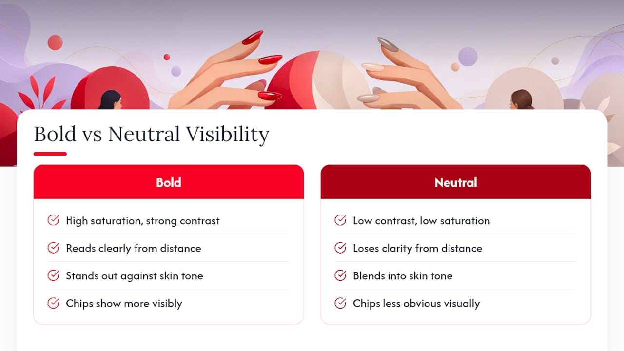
Ask about gel versus lacquer for longevity, since bold colors show chipping faster than neutrals simply because the contrast between chipped and intact polish is so visible. A good topcoat matters more on bold shades than muted ones for exactly this reason.
Bring a photo reference or the exact polish name whenever possible
Ask whether sheer layering can approximate a shade the salon doesn’t carry
Ask about gel versus lacquer, expected wear time, and removal method before you sit down
Ready to put this into practice? Booking a manicure is the fastest way to see how a bold shade actually looks on your hands instead of guessing from a bottle. If longevity is your priority, SNS dip powder holds saturated pigment exceptionally well and resists the chip-visibility problem that plagues regular lacquer in bold hues. TJ Nails technicians in Bradenton can also walk you through specific color combination ideas if you’re not sure where to start.
What Actually Matters When You Pick a Bold Shade
Most advice on bold nail color stops at “know your undertone,” and that’s only half the equation. Undertone tells you which family of bold colors will flatter your skin, but it says nothing about finish, placement, or how the color will hold up against chips over two weeks of daily use. Those practical details decide whether you love the manicure on day one and still love it on day twelve.
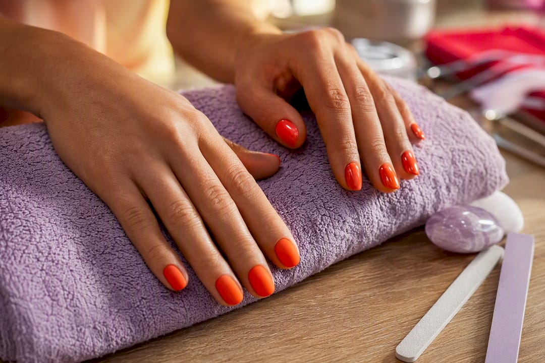
The conventional advice also underrates finish as a control lever. People treat color and finish as separate decisions, when finish is often the faster way to adjust how loud a shade reads. A matte tangerine and a glossy tangerine are almost different colors in how they behave on the hand.
If you take one thing from this, prioritize the undertone check first, then decide on finish and placement before you commit to full coverage. Bold color rewards a little planning. Skip that planning and you end up with a shade that fights your skin tone instead of working with it.
Frequently Asked Questions
Why do bold colors suit nail art better than neutral shades? Bold, high-saturation colors create stronger contrast at small scale, so they read clearly even from a distance. Neutrals blend into skin tone and lose definition on tiny surfaces like nails.
How do I know which bold nail color trend will suit my skin tone? Check your undertone using the vein test on your wrist. Warm undertones lean toward coral, tangerine, and teal, while cool undertones suit fuchsia, sapphire, and emerald.
Can bold nail colors actually affect my mood? Color psychology research links warm saturated hues to increased activation and cooler hues to a calming effect, and because nails stay visible all day, that effect repeats itself constantly.
What’s the easiest way to wear bold color without it feeling like too much? Use an accent nail or a colored tip instead of full coverage. It delivers the same personality in a smaller, more manageable dose.
Do bold nail colors chip more visibly than neutral shades? Yes. The contrast between chipped polish and intact color is more obvious on bold shades, which makes a quality topcoat and gel formulas more valuable for longevity.
Sources
Recommended
Comments